Artist Spotlight: Jonathan Abney

Jonathan Abney
Quarantine Cool, Jonathan Abney. Digitial.
Jonathan Abney

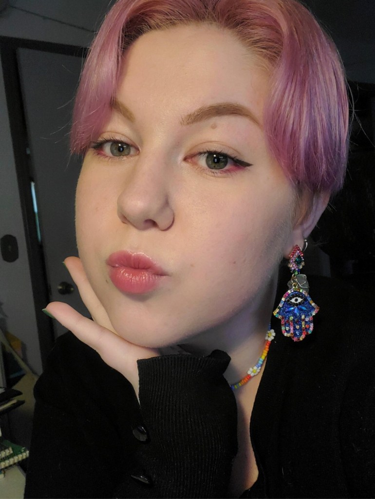
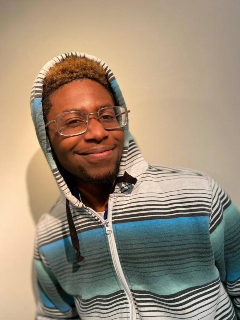
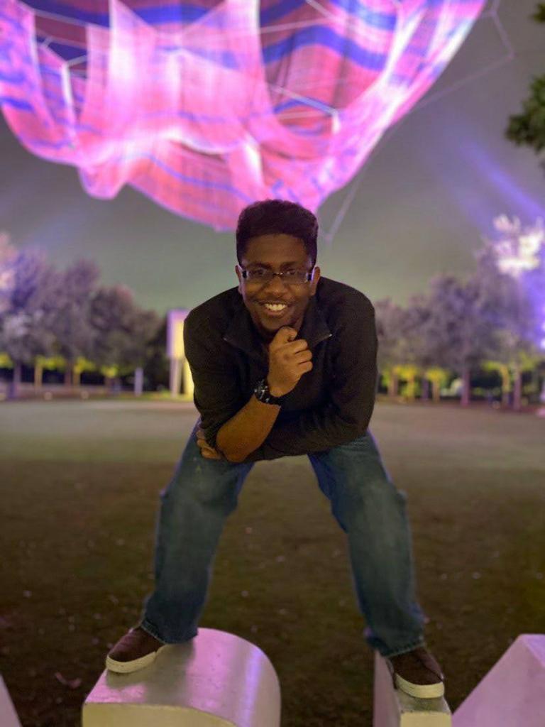
The GC Art Column’s own Jonathan Abney was born and raised in Greensboro, North Carolina. He is a Greensboro College junior majoring in Art. He enjoys video games, YouTube, animations, and art.

“Since 2nd grade, [art has] been something I’ve always enjoyed doing.” Stated Abney. “It started as something I did on the side of worksheets in class, a lot of my early teachers either liked or hated that. My mom liked my art and the little books I made A LOT, so I knew it made others happy.”

Eric Icon, Jonathan Abney. Digital

It wasn’t until middle school that Jonathan started to take his art seriously, when a friend of his introduced him to comics. It was then that he realized he wanted to be a cartoonist.

“I wanna be something where I’d be able to substantially support myself and get to do what I enjoy.” He says as he reflects on his future as an artist. “I don’t really have a concrete plan but I don’t feel entirely clueless on where I want to be. I enjoy lots of animated shows, video games, and contrary to popular, I’m not a vivid comic reader. I enjoy them all the same because they all spark ideas for my own head.”

Pinked Lovers, Jonathan Abney. Digital

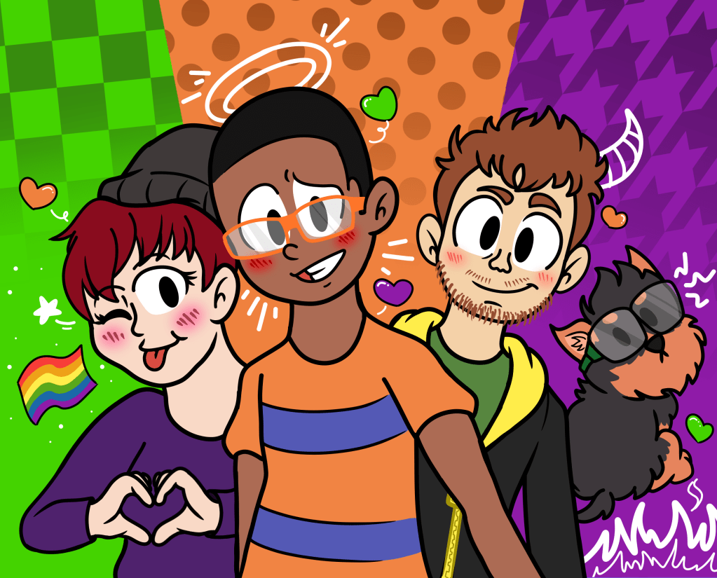
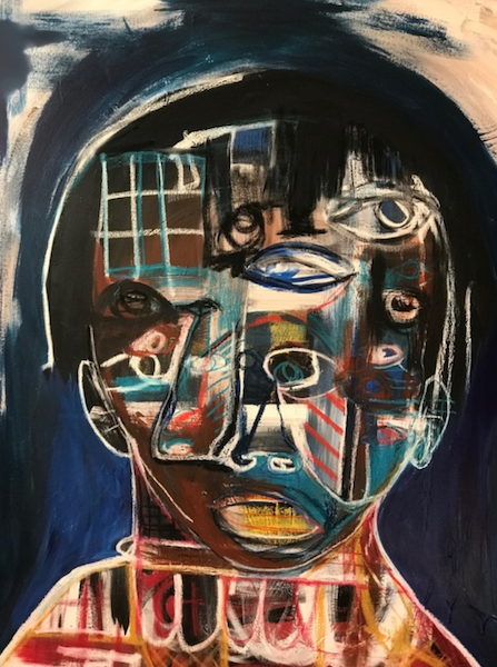
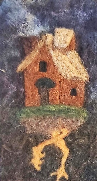
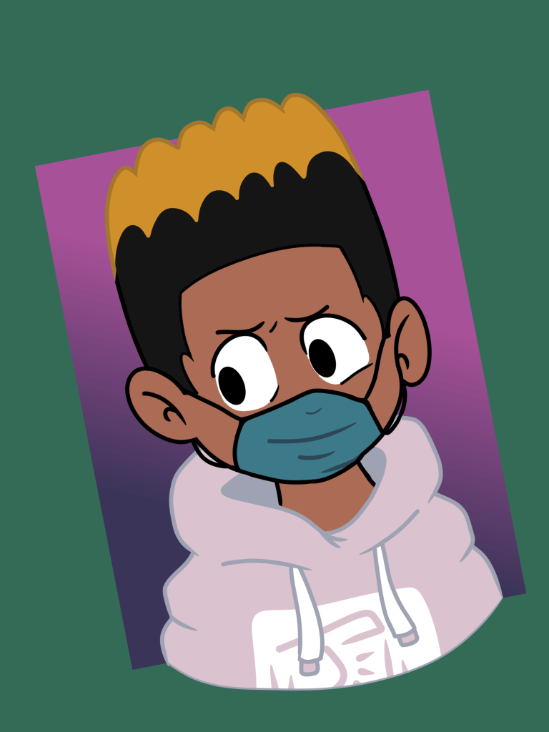
Jonathan has practiced in many different mediums while being an art major at Greensboro College but is more gravitated towards traditional drawing and drawing digitally.

So far, Jonathan has done several commissions as well as made comics for the Greensboro College newspaper, The Collegian.

Summer Cover, Jonathan Abney. Digital.

You can find Jonathan and check out his works on his Instagram and Twitter which will be found below!

Twitter: https://twitter.com/jjjabbers

Instagram: https://www.instagram.com/jonnyjraws/

Why Nintendo’s The Legend of Zelda: The Wind Waker Will Always “Age Well”

In 2003, Nintendo released their 10th installment of The Legend of Zelda series with The Wind Waker for the GameCube.

Fans were ready for another adventure with Link as just a few years prior, both The Legend of Zelda: Ocarina of Time and The Legend of Zelda: Majora’s Mask were released for the Nintendo 64.

Screenshot from The Legend of Zelda: The Wind Waker

However, a lot of backlash came with the release of The Wind Waker as fans much preferred the more “realistic” and “darker” themes of the past games.

The Wind Waker sports a cartoon-styles scenery and characters, as Link is shown very small with stubby features and big eyes. Nintendo used cel shading to render the game to make everything seem flatter and more cartoonish as bright colors and rounded textures are littered throughout the game.

Luckily, over time, The Wind Waker became a favorite to many and the hatred over the cel-shading. Bill Trinen, a Product Marketing Director at Nintendo, referred to this as the “Zelda cycle.”

Screenshot from The Legend of Zelda: Ocarina of Time

The Legend of Zelda’s producer, Eiji Aonuma, added to this by saying, “Basically, as time progresses, negative opinions about The Legend of Zelda turn into positive ones.”

He was right, because in 2006, Nintendo released The Legend of Zelda: Twilight Princess, which had much more realistic graphics, and a lot of fans at the time wanted more of the expressive cartoon style that The Wind Waker had.

Screenshot of The Legend of Zelda: Ocarina of Time

When looking at the original release of The Wind Waker in comparison to Ocarina of Time, it is clear which game aged better. Even for a 2003 release, the roundness and bright, vivid colors of The Wind Waker do not show as much age as the geometric and natural shading of Ocarina of Time.

This difference can really be seen in the different textures of the water. In Ocarina of Time, the water is see-through and was meant to mimic real water. In Wind Waker, the water is bright blue, accented with curvy white lines to represent the waves of the ocean.

Screenshot of The Legend of Zelda: Wind Waker

Of course, what really matters is how well the game plays and not just how good the game looks. But I think it is easy for people to agree that simple, toon-styled games like The Wind Waker tend to age better.

Resources:

Nintendo Was Well Aware Of The Wind Waker Backlash, Discusses The ‘Zelda Cycle’

“Walk the Light” Genesis Tramaine

by: Malcolm Ford


Genesis Tramaine, Walk the Light, 2019
Acrylic, Oil Sticks and Spray Paint on Canvas
60 × 48 in
152.4 × 121.9 cm
.


It’s hard to describe Genesis Tramaine’s specific style for portraiture but maybe that’s the point of their work. It’s easy to see just from the way it looks how it was created with raw emotion and expression but also deep consideration of what to highlight or draw attention to in that portrait, wear to place the love. A lot of these portraits seem to me to include texture within the portrait each one tells you a story especially with all of her portraiture in fact. Regardless, her portraits are always interesting to gaze at
just to draw out the connection she’s had with these people or possibly the conversation that might have influenced the portrait.

https://www.artsy.net/artwork/genesis-tramaine-walk-the-light

Artistically Speaking!

Hi! I’m Jonathan Abney! I’m an art major who writes for the website and I wanted to introduce you to my segment called Artistically Speaking. It goes over all sorts of media, television shows, video games, movies, and essentially anything that catches my eye. I wanna talk about how things work artistically in everyday life and what makes you enjoy what you enjoy even more (or less). 

Artist Spotlight: Hannah Hook

Apple Still Life by Hannah Hook. 2020

Hannah Hook is a local student artist who attends Randolph Community College in Asheboro, North Carolina. Originally from Virginia, Hannah and her family moved to North Carolina in 2003 and have been here ever since.

Hannah Hook

Ever since she was a kid, Hannah loved art and loved making art. It wasn’t until High School when she really devoted herself to her art.

“My mom was very artistic so there was always that vibe in the house.” She says.

When I asked her, “Why do you do art?” She states, “I just fucking do it, I just do it. I like it. That’s it.”

Hannah has experimented with most mediums, but she typically enjoys painting with oil the most and experimenting with mixed media and found objects.

Baba Yaga’s House. Hannah Hook. Needle felting.

“You have more room to play with when messing with oil since it takes longer to dry. There’s space to try different styles, and since I really like impressionist and fauvist painting, you can choose how well you want to blend everything or choose to have the brush strokes to be very thick and obvious.”

Billie Eilish, Hannah Hook. Oil Paint.

Though Hannah does not want to pursue art as a career, she wants to keep it as a hobby she continues to practice.

“I like to be in complete control of my art.” She states. “Once there’s a deadline or a ‘grade’ put on a piece, it only brings me stress instead of joy and I don’t want that to happen with something I love.”

You can find Hannah and her work on her Instagram below.

Hannah Hook’s Instagram:

https://www.instagram.com/samhook55/

For The First Time In Over 200 Years, New Blue Pigment Is Discovered

This new shade of blue called “YInMn” or “Yin Min Blue” was created accidentally by chemists at Oregon State University in 2009.

The color had to first be approved by the Environmental Protection Agency in order for Yin Min Blue to be used for commercial use.

It can be found for sale in select stores, but don’t rush over to your local craft store just yet, as a 1.3-ounce can go for $179.40.

The color is so special due to how opaque it is and is much more durable than Prussian blue. It also reflects infrared radiation, keeping the surface underneath cool.

Artists like it for its use of color, but what is especially important is what the pigment does for environmental regulations when it comes to building products.

Though the pigment is approved for commercial use, it is rare to find it, as some find it too expensive, and then it seems that those that do buy it, buy it for bragging rights.

Resources:

https://nypost.com/2021/01/27/new-pigment-yinmn-blue-discovered-now-for-sale/

Artistically Speaking: De Blob

Hey, so today I wanna talk about a video game that has been a part of my life since childhood and apparently everyone else’s too! Coming out originally in 2008, De blob is a platformer that has a small irregularly shaped blob (hence the name) that has the power to color the world that he lives in with the power of paint. This being especially useful as Chroma City, the place he lives(?) or sleeps(?) in, is being invaded by INKT, a corporation entirely bent on taking the world’s color away, leaving nothing but empty, barren black and white landscapes. It’s essentially a fight between those who want to live a life of freedom in color and INKT who want a world without it. 

Right, but this ain’t about that. This is about what this game does artistically. First, its presentation. I think, while in today’s standards, there’s absolutely no doubt that it doesn’t look all that appealing. Oh god, the character models. But what stands out about this game is its style. The UI (User Interface) is always important in a game, as it’s used to translate to the player how the game operates. Animation helps a lot with that and it makes up a big part of this game’s personality. Everything that moves on the screen is wonderfully spaced so you get enough of what you’re and what you need to do. And from the way that everything jumps when you touch it, to the characters themselves being expressive and showing you how they feel through their movement, this game does so much with what little it has. 

julianozuca's Review of de Blob - GameSpot

And my favorite part has GOT TO BE THE MUSIC! When you gain color, it plays a little ditty. Each color has a specific sound to it for each song and the more color there is, the more music you hear. This type of progression of the music helps make doing anything in the game more immersive, as the sound that plays follows along with the music playing throughout the level. And all of it culminates together to create a gaming experience that you seriously can’t forget. Which is probably why so many people remember it from their childhood. Nostalgia everyone.

Unveiling for Michael Rakowitz’s ‘The Invisible Enemy Should Not Exist’ in Trafalgar Square (Lamassau)

by: Malcolm Ford

Michael Rakowitz, “The Invisible Enemy Should Not Exist” (2018), on Trafalgar Square’s Fourth Plinth (photo © Gautier DeBlonde, courtesy the Mayor of London’s Office) https://hyperallergic.com/436134/michael-rakowitz-fourth-plinth-trafalgar-square-london/


I feel this is a great unveiling of Michael Rakowitz’s project as a whole. ‘The Invisible Enemy Should Not Exist’ is the name of the project which seems to be a protest against the destruction and frankly pillaging of Iraqi art to be put in Western museums. A common and most striking theme about the collection is the use of Iraqi labeled products in the sculptures or on the outside of the Lamassau. The labels all say “Product of Iraq” which is a great way of showing how far off some of our understanding of the origins of some of these pieces truly rooted from.

Michael Rakowitz, “The Invisible Enemy Should Not Exist” (2018), on Trafalgar Square’s Fourth Plinth (photo © Gautier DeBlonde, courtesy the Mayor of London’s Office) https://hyperallergic.com/436134/michael-rakowitz-fourth-plinth-trafalgar-square-london/

“Speakers Outside Justice Center 11” Portland, OR

by Malcolm Ford

Steve Mumford, Speakers Outside Justice Center II, Portland, OR, Jul. 31, 2020, 2020, pencil and ink on paper, 11 × 15.5 inches. https://bombmagazine.org/articles/protest-drawings/


The crowd suggests that this demonstration was successful and all who could draw the nerve were able to speak their hearts at the stage and explain some of their frustrations with such a faulty system. Those few got to be the burning spears of the offense of police and judicial reform. You can tell he really tried to capture the raw emotion the man was feeling when he had to say these words. It’s painful and the fact that the “I’M SORRY!!” is in red is just another painful reminder to just how hopeless and empty those words feel now, just as they did back then.

Steve Mumford, Speakers Outside Justice Center II, Portland, OR, Jul. 31, 2020, 2020, pencil and ink on paper, 11 × 15.5 inches. https://bombmagazine.org/articles/protest-drawings/

“Black Lives Matter Protestor Shouts at Cop and Back the Blue Demonstrators” Bay Ridge, Brooklyn, NY

by Malcolm Ford

BLM Protestor Shouts at Cops and Back the Blue Demonstrators, Bay Ridge, Brooklyn, NY, Jul. 12, 2020, 2020, pencil on paper, 11 × 15.5 inches.  https://bombmagazine.org/discipline/art/

A powerful scene yet one of many in Steve Mumford’s collection of drawings and paintings of his day to day in New York. With the BLM movement in full swing and all of the demonstrations going on this was obviously a great opportunity for him as well as helping spread awareness through his art.

The empty space of the crowd with only a few heads poking out and the only one given much detail being the one with a microphone, speaks volumes to how many people of color felt, feel and are feeling when police reform doesn’t change.

A great way to describe it is like the voice inside your head, you can’t make it any louder however hard you try or at least that’s what it feels like when no amount of protest, demonstrations, phone calls or hugs feel like enough and you’re left there to fight an insurmountable, inconceivable, unrepeatable fight.

BLM Protestor Shouts at Cops and Back the Blue Demonstrators, Bay Ridge, Brooklyn, NY, Jul. 12, 2020, 2020, pencil on paper, 11 × 15.5 inches.  https://bombmagazine.org/discipline/art/