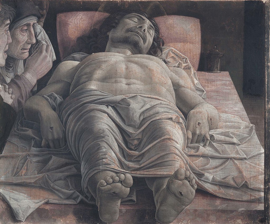
The Foreshortened Christ by Andrea Mantegna features exactly the title of the painting: a foreshortened Christ. Christ lays with a cloth draped over him with the holes in his hands and feet exposed as his mother and Saint John. The painting is enveloped with dread and sadness as we watch the Virgin Mary mourn the death of her son. However, though an emotional painting, there seems to be a lot wrong with it compositionally. Christ’s feet are much smaller than what is proportionally correct – but Mantegna did this on purpose as he knew the feet would cover much of his body, and he wanted to show viewers the entire thing.
Like may representations of Christ, there are holes in his hands from where he was positioned on the cross. However, this would not work in practice. The bones in our hands are not strong enough to hold us up, even with nails in them. It would most likely be that Christ was probably nailed in his wrists, as that would hold him up better than having nails in his hands.
Credit: KLEINER, F. R. E. D. S. (n.d.). Gardner’s Art through the ages: A concise global history. CENGAGE LEARNING.
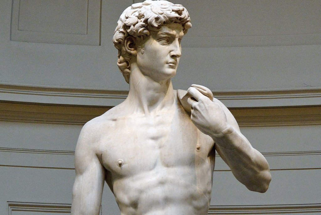
Michelangelo Buonarroti is perhaps best-known for his paintings on the ceiling of the Sistine Chapel, but Michelangelo’s true passion was sculpture. One of his most iconic sculptures is his statue of David, but his David, while being a very beautiful piece of sculpture, does not amount to the sheer power and emotion of the Pieta. The Pieta shows a young Virgin Mary holding the limp body of Jesus Christ in her lap. Michelangelo’s remarkable craftmanship with marble shows how heavy the scene is but using such large folds in Mary’s drapery and by making the weight of Christ feel very heavy, such as the burden of losing a child.
So why talk about this piece?
The Pieta got a lot of backlash at first. Why is Mary so young? Why is she so big compared to Christ?
According to Fred Kleiner, “Michelangelo explained Mary’s ageless beauty as an integral part of her purity and virginity.” Christ himself also appears very beautiful as he seems to be peacefully asleep than dead. Michelangelo also made a point to make the wounds at his hands and feet barely visible.
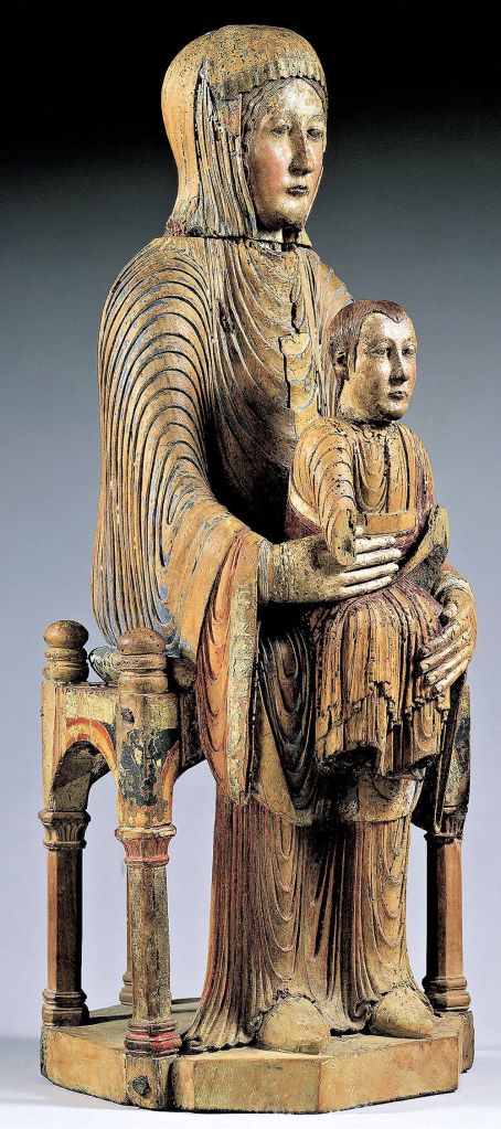
As for Mary’s size, art historians have theorized Mary acting as both a mother and a throne. In many paintings and sculptures, Mary has always acted as a throne for a young Christ, just like the Morgan Madonna from Auvergne, France. Here, Michelangelo capitalizes on that by making her so large.
Hans Holbein the Younger was one of the leading artists of the Holy Roman Empire who painted The French Ambassadors using oil and tempera paint. The French Ambassadors depicts Jean de Dinteville and Georges de Selve standing on either side if a shelf with an array of many different objects, all with meaning behind them. There is a lute with a broken string that symbolizes discord and religious strife. The crucifix that is half hidden behind the curtain encourages the viewer to think about death and the idea of resurrection. One object so strange is one that can’t be correctly seen from a frontal view.
What is that large, dark shape diagonally placed at the bottom of the painting?
If you look at the painting from its side, you will find out that it is a skull. Holbein and many other artists typically put skulls in paintings to symbolize mortality or memento mori (remember that we die).
But why distort it?
According to Tim Brinkhof, the skull is distorted to be kind of hidden in the image — as if death can sneak up on you at any time. The act of distorting an image like this is called an anamorphic image, implying that it is distorted in a way in which it can be viewed from a certain angle.
Besides the odd rendering of the skull, everything else in the image is placed perfectly. The lute and floors are both in perfect perspective, and everything was painted and planned so carefully and meticulously.
Credit:
KLEINER, F. R. E. D. S. (n.d.). Gardner’s Art through the ages: A concise global history. CENGAGE LEARNING.
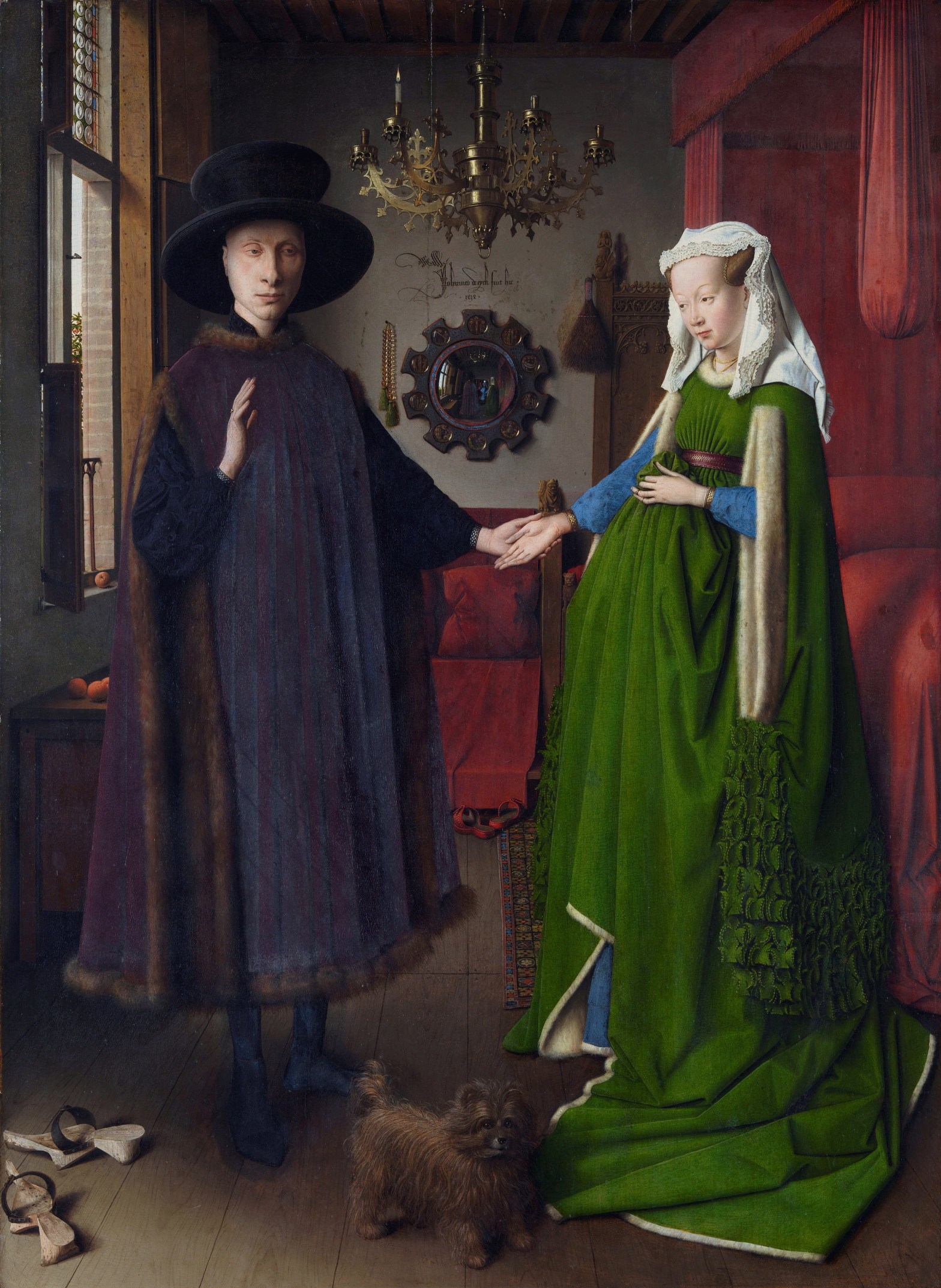
Giovanni Arnolfini and His Wife is a painting by Jan Van Eyck during the Early Renaissance period in Europe. The painting depicts Giovanni Arnolfini, the Lucca financier “(who had established himself in Bruges as an agent of the Medici family),” along with his second wife, whose name is unknown (Kleiner). It is implied that the couple are taking their marriage vows, as we see Arnolfini raising his right hand. It is also noted that every object represents something to do with the setting. For example, the dog represents fidelity, representing faithfulness and loyalty. There is a tiny statue on the bed of Saint Margaret, who is the patron saint of childbirth. It appears that the wife is pregnant by the way she holds her drapes to her stomach, but she is not. What is so mysterious, is the placement of the mirror and the words that are written above it.
What does it mean?
Art historians have speculated that “the room in which Arnolfini and his wife stand in a public reception area, not a bed chamber” and that perhaps “Arnolfini is conferring legal privileges on his wife to conduct business in his absence” (Kleiner). In the mirror, we see the two people, one of which must be Van Eyck himself, as above the mirror, the writing says “Johannes de Eyck fuit hic” or “Jan van Eyck was here.” According to Fred Kleiner, this signature also “underscores the painter’s self-consciousness as a professional artist whose role deserves to be recorded and remembered.” Still today, this painting carries a lot of mystery, as we do not know the name of his wife or what action here is really taking place.
KLEINER, F. R. E. D. S. (n.d.). Gardner’s Art through the ages: A concise global history. CENGAGE LEARNING.
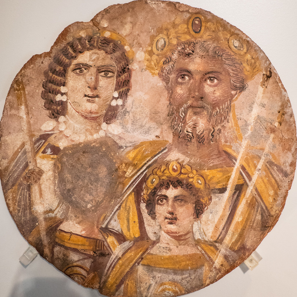
After the death of Marcus Aurelius’ son, Commodus (r. 180 – 192 CE), there was civil conflict, and a general named Septimius Severus became master of the Roman world. His family portrait was painted with tempera on wood and it features himself, his wife, Julia Domna, and his two sons, Geta and Caracalla. What makes this piece so interesting is the use of gray in Severus’ hair, showing him in his later years (something that was not common in the art representing rulers; usually sculptures and paintings showed rulers in their prime). It is also interesting how there are only three faces shown in the painting when there is supposed to be four.
What happened to Severus’ son, Geta?
In 211 CE, Caracalla succeeded his father as emperor, he had Geta killed and his face erased from the portrait, damning him and his memory forever. According to Fred Kleiner, “the Severan family portrait is an eloquent testimony to the long arm of Roman authority, which reached all the way to Egypt in this case.” He implies that Roman Government used damnatio memoriae (or damnation of memory) as a political tool, symbolizing the great power rulers had over their own people.
Credit: KLEINER, F. R. E. D. S. (n.d.). Gardner’s Art through the ages: A concise global history. CENGAGE LEARNING.
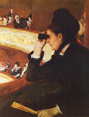
Mary Cassatt was an American Impressionist in the mid 1800’s. Her subject matter mainly included women in leisure activities, or sometimes in the privacy of their homes living a domestic lifestyle. In one painting of hers, The Woman in Black at the Opera, Cassatt’s subject is a woman dressed in black using her Opera glasses to view the opera taking place on stage. In the background, we can see a man using his opera classes to gaze at the woman, making her his spectacle. Not only does he make her the spectacle, but we, as viewers, gazing upon the woman, are also partaking in the same activity as the man.
What is the point of all of this?
Well, according to feminist theory, “Man has put himself at the center of the universe as the only real subject, the only true thinking being, while woman is an object to be admired, feared, used, simply looked at, or ignored” (Venturino). We can argue that the woman here is there to be admired by the man in the background, as it is implied by patriarchal society. Rather than focusing his attention to the stage, his eyes are focused on her. According to Whitney Chadwick, author of “Women, Art, and Society”, “Feminist theory has often held to the premise that the viewing field is organized for a male subject who exercises power through looking, and in this way, asserting visual control over the objects of his desire (usually female).”
Not only does Cassatt’s painting feed into the patriarchal idea as the woman as a spectacle, but it also delves into the realms of a consumer-oriented society. We as viewers are also staring at the woman, who is just enjoying her time at the opera. During this time, the focus of leisure activities in art were becoming what people wanted to see more of, thus causing artists to produce more of what people wanted to see, rather than what they themselves wanted to create.
So, what should we take away from this?
It is important to understand the background of the artworks that we admire. What inspired the artist? Why did the artist paint this? During the 1800’s, it was restricted for female artists the hang out with their male colleagues, so many of the famous female Impressionists, such as Mary Cassatt and Berthe Morisot, typically only painted other women or women with their children. It is important to understand that, because of these restrictions, it influenced what those like Morisot and Cassatt painted, why they painted it, and who was to admire it.
Credit:
Chadwick, W., & Frigeri, F. (2020). Women, art, and Society. Thames and Hudson.
Venturino, S. J. (2013). The Complete Idiot’s Guide to Literary Theory and criticism. Alpha, a member of Penguin Group (USA) Inc.
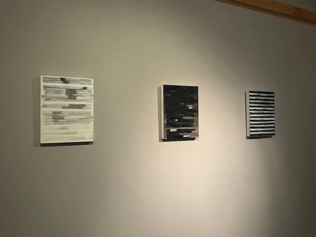
Back in October of this year, the Greensboro College art department showcased artwork done by artist Kenn Kotara. Kenn Kotara is a mixed-media abstract artist based out of Asheville, North Carolina. The name of this exhibit was, Social Geometries, as it was a continuation of his exploration into the anthropological quality of Braille and the consideration of metaphorical implications to human interaction. Creating a visual representation of the braille language he portrays the concept that even though we may be able to see something that is in front of us, our pre-existing beliefs and biases impair us from understanding what we really see.
Kenn Kotara’s installation piece. Layed across the floor, each golden piece of paper is indented with Braille lettering.
Braille on thin steel sheet
Braille on painted canvas
Instead of just having a flat sheet of paper on the wall with braille on it, he chose to dance between both two and three-dimensional spaces. His use of different patterns and colors on paper, wood, and or steel really brings out an interesting texture in his work. Because of the texture being so visually appealing in these works, it feels as if each piece is inviting you to come and take a closer “look” at them.
Kenn Kotara does hold local and out of state exhibitions of his work and if you are curious to know more about him and his previous works, you can check out his website https://www.kotarastudio.com/
Never thought it would be possible for someone to steal a famous piece of artwork but for a fifty-nine-year-old Dutch art thief, who goes by the name of Nils M, that seemed pretty easy. The paintings involved are the van Gogh painting titled The Parsonage Garden at Nuenen in Spring (1889) which was stolen from the Singer Laren Museum. A few months later, the famous painting entitled Two Boys Laughing with a Mug of Beer, by Frans Hals was stolen from the Museum Hofje van Mevrouw van Aerden, in Leerdam. This all took place in March of 2020 during the covid lockdown in the Netherlands.
Vincent van Gogh’s Parsonage Garden at Nuenen in Spring painting. Part of the Post-Impressionism movement. Medium is oil on paper on panel.
So just how in the world were these famous paintings stolen anyway? Well according to the article I read the van Gogh was on loan from the Groninger Museum when it was stolen and security footage showed a man smashing into the museum with a sledgehammer and then take off with the painting under his arm. Pieces of the painting’s frame were found in the parking lot. The only type of question I had after reading that was why? Why didn’t the museum, knowing that they had a famous van Gogh painting, have better security? Why did this older, already pushing sixty-year-old man choose to use a sledgehammer to break into a museum? Out of all of the other things he could have used, he chose a noisy, ear-splitting sledgehammer? And why did he leave pieces of the frame in the parking lot? Like is he wanting to get caught? I know if I were to go to such great lengths to steal a famous painting, the last thing I would want to do is leave behind any evidence that could lead back to me.
Frans Hals painting, Two Laughing Boys with a Mug of Beer, painted in 1626. Medium is oil on canvas.
I was very intrigued when reading about how the Hals painting was snatched. I was also kind of shocked to find out that the painting had been stolen twice before, 1988 and 2011, making this the third time it was stolen. But how?? Who lets a famous painting get stolen for the third time? You would think after the second time it was stolen there would be better security measures in place but I guess not. During the third time it was stolen, the back door to the Hofje van Mevrouw van Aerden museum, where the painting was on display, had been broken and there was an orange tension cord tied to a flagpole in the garden outside the museum. I guess you could say that Nils M did somewhat of a better job in stealing this painting except for the fact that he once again left some type of evidence behind.
Nonetheless, Nils M was found and arrested. During his hearing, he denied knowing anything about the stolen paintings but he couldn’t explain as to why his DNA was found at both of the museums where the pieces were taken. He literally left evidence behind. Which had his DNA. And he couldn’t explain that? Seems suspicious to me. Anyway, he was found guilty and sentenced to eight years in prison. He is also expected to pay a hefty fine of €8.73 million.
A popular genre of video games are fighting games; They collect a specific fanbase unlike any other. (For better or worse…) Fighting games seem pretty simple: you put a couple of dudes together and make them punch/kick each other and sometimes wave a sword. I may be simplifying it but only for anyone unaware of how these types of games work. Either way, fighting games come in many different shapes and sizes, and I’ve been a fan of them for years now. “Super Smash Bros. Brawl” was the first fighting game I had ever played, and whether or not you play competitively or causally, you understand the value that game has for many fans like myself. But more importantly, over the years I’ve come to love fighting games for the sheer amount of variety in unique styles, music, and the overall presentation of creativity.
The topic for today is a crossover fighting game. You see, some fighting games like “Super Smash Bros.” or “Blazblue Cross Tag Battle” are a big collection of a number of popular properties of very well known characters. The purpose of this would be to put a character fans are familiar with in a brand new setting. Where sometimes it can be through unique character interactions, animations, or some other ways of just communicating to the player that this is that character you know and love plopped in a world they are all too unfamiliar with, ready (or reluctant) to explore it.
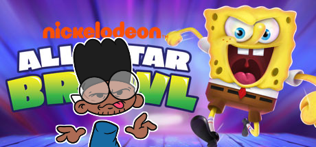
And that’s the same case for Nickelodeon All Star Brawl. Except No. No, it’s not.
“Nickelodeon All Star Brawl” (NASB) is a fighting game that features a collection of popular Nickelodeon characters from across the channel’s lifetime. It’s a game coming from a company called Ludosity. They developed the well received indie fighting game called Slap City. And despite how on the surface NASB is just another Nick game for kids with consoles, its name got around the internet quicker than it should have, gaining popularity from Super Smash Bros. Ultimate fans from all around. Which is probably because it’s heavily inspired by the Smash Bros. series, and you can tell from certain mechanics, UI choices, and character animations. However, that may be its first defining problem… There are a lot of aspects of the game that were made to mimic Smash Bros. or more importantly their predecessor game, Slap City. Which isn’t too much of an issue until it ONLY comes off as a cheaply made imitation. Now, in some ways, the game has its own identity through its mechanics that competitive players can enjoy such as Rollback Netcode, combo oriented moves, etc., which in some regards, is done better than the Super Smash Bros. series. But while those are a good few steps, it’s one HELL of a leap backwards in terms of what it should focus on.
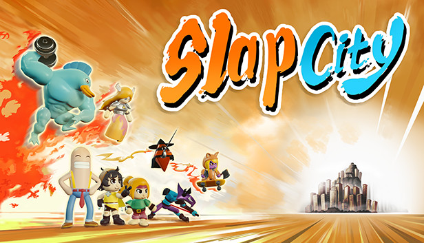
In most cases, whenever you create anything, it will always be similar to something you’ve seen before. It’s a common idea that everyone understands, but in some ways, the property you create can carry a feeling of its own and seem completely new. “A Hat In Time” (A game I previously went over) showed us a world with its own characters, and that made the game stand out from its competition with other 3D platformers. And in contrast, Playstation All-Stars Battle Royale had a distinct lack of effort that made it susceptible to just being a “smash clone”. Even with the attempts put in place to make it feel unique, it didn’t grant itself anything special other than its roster of Playstation characters, who were NOT the best picks. (Something else this game mimics, other than “All Stars” in the name. Hope that isn’t some sort of bad omen…) In regards to Slap City however, its personality comes from the way it looks and moves. While it does have that “beginner-game-developer” feel, it comes off completely as charm from the way it presents everything else design wise.
Slap City, presenting its colorful antics and cute cast of characters.
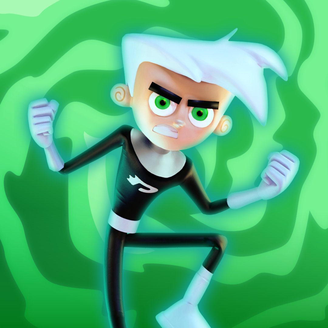
But NASB fails to capture that same feeling for NUMEROUS reasons: The characters themselves feel off and seem to be animated unprofessionally. Each character moves way too fast, a choice most likely made to support competitive play but when you have characters who should have different weights to them, that doesn’t help with how it feels to play them. Which goes into my second reason being that their movesets are initially unoriginal. Some moves make impressive references to the character’s show, but the standard moves seem more just like a copy of a move that any other character can do. Like an up jab from Patrick is him upper-cutting with a snack in his hand, while SpongeBob does the same thing with just his leg. This is present in fighting games traditionally, as sometimes it’s just a single move. But if a majority of the roster can do that same thing, I feel it should be time to look for an alternative. Its most egregious reason is in how it looks. DEAR GOD does this game show you how NOT to demonstrate design from how UGLY it is. There are some places where characters look just fine, there’s a good looking character render of Danny Phantom in the main menu of the game. But his ACTUAL RENDER? His is one of the worst transitions from 2D to 3D in this game.
The Official Render For Danny Phantom from Nickelodeon All Star Brawl
[Taken From Fanbyte} The Main Menu featuring Spongebob, Donatello, Sandy, Reptar, and Danny Phantom.
Toph looks absolutely lifeless with her single slit for a mouth, and while Patrick and SpongeBob are better off, they just have small odd choices. Why does Patrick’s mouth look like it’s falling off?! Why does SpongeBob’s mouth go more into his eye than his cheek?! These inconsistencies are scattered around all of the characters, which is probably because of the terrible looking art style they chose to go with. And the more you see it, the less satisfying it is to play. This all culminates to where it doesn’t feel like those Nicktoons that everyone recognizes any more than it does a video game model moving on a screen.
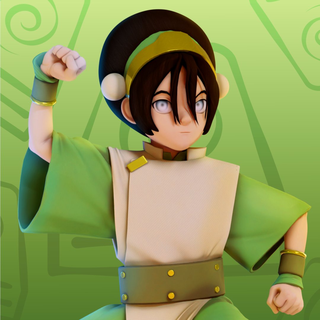
The Official Render For Toph from Nickelodeon All Star Brawl.
The Official Render For SpongeBob from Nickelodeon All Star Brawl.
The Official Render For Patrick from Nickelodeon All Star Brawl.
So, in the end, there was a project with a lot of promise that unfortunately stumbles over its own feet. In fact, this title has a lot of potential especially with its roster. Almost too much potential, really. I’ve seen people come up with Just to have a better understanding of how Nickelodeon treats their properties, I decided to check out the quality of the other Nick crossover games that recently came out. These were just the racing games, which starred a similar cast of popular characters but nonetheless, they suffer the same issues. In THAT department, there’s consistency in quality… and it looks like it’ll follow the trend of being only good enough for kids to enjoy. Which isn’t a terribly bad thing, but when adult fans of fighting games only look at this game as long as a kid with a short attention span, all of the attention it’s garnered will fade quicker than it should. I don’t exactly know how the game could ever fix these problems (or if it ever will) other than a sequel, but it’s got a lot of work that needs to be done. And from what the first game presents, that may forever stay a fever dream.
Artist’s Note: For the record, the soundtrack for the game is actually pretty great, and not just generic unrecognizable pieces like you’d expect from the game’s predecessors. If you can appreciate musical styles similar to shows they represent, then check out the stage themes! It’s worth a listen!
The Animal Crossing series is a Nintendo franchise that allows a social, interactive, and creative play style. Originally released in 2001 in Japan for the Nintendo 64 as Animal Forest, the series has flourished and grown with every game that has been released. The franchise was created by Katsuya Eguchi and Hisashi Nogami and mainly designed by Koji Takahashi (Lane). The series features the player as a human living in a world with anthropomorphic animal neighbors. The games are based on real-time interaction and simulation, allowing the player to play in their own way during their own time.
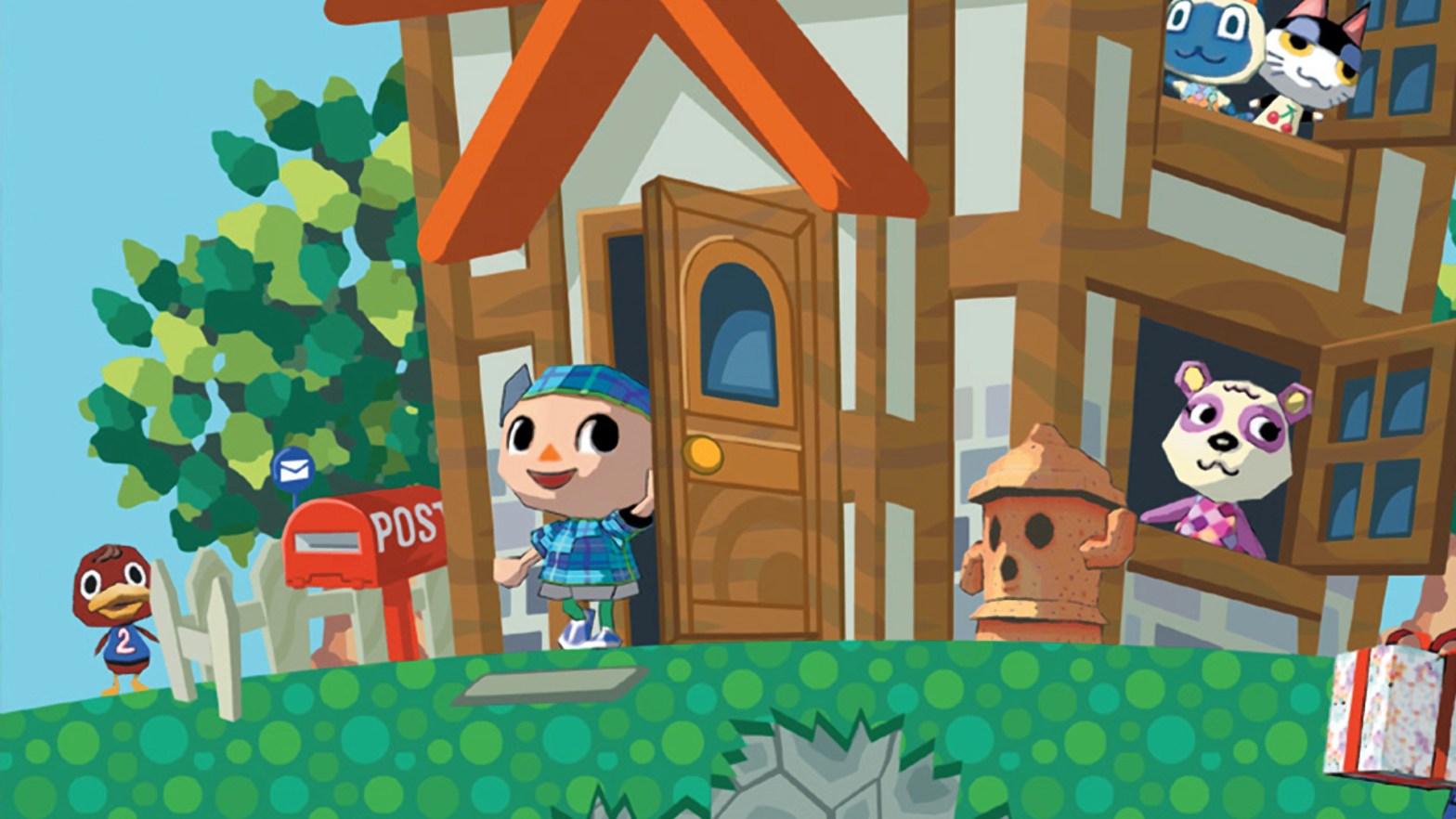
Screenshot from Animal Crossing: New Leaf
The player’s villager has typically had the same art style since the N64/Gamecube version. The villager has a very large head, big eyes, a small body with thin limbs and round balls for hands. Even today in the Nintendo Switch release of Animal Crossing: New Horizons, the character has remained the same, though they sport a taller body, a change that began with the 3Ds title Animal Crossing: New Leaf. There are different eyes and hairstyles to choose from, as well as different skin colors, mouths, and noses as added in the Switch version. But throughout every game, the character has been modeled with spherical hands – and it works! The villager is often switching between many tools and items and it does not feel or look awkward since their hands are in an eternal static pose. I personally feel if the villager had fingers, it would look a little weird since everything else is created in a rounder and smoother fashion. So the 20 year-old design choice to have spheres for hands was a good move.
From Left to Right: Goldie, Punchy, Sprocket, and Drago
In every Animal Crossing game, the player has always had animals for neighbors. There are 35 species types with a total of 393 animal villagers (Spear). Each animal villager has their own unique design, ranging from looking like your average cat to robot frogs to mythical creatures. Some animal villagers, depending on who you ask, are deemed as “ugly villagers” — which of course, is a matter of opinion. Typically these “ugly villagers” just do not cater to the player’s aesthetic, but everyone’s aesthetic is different. If the game had all “cute” and “perfect” animal villagers, there would be no diversity between each players’ worlds. The amount of effort it has taken the creators over the years to perfect villager designs as well as doing their best to make them all unique looking in their own way is extraordinary. Whether they have a basic, generic, animal design like Goldie or Punchy, or if they have almost other-worldly designs like Sprocket and Drago, each one represents the amount of detail that has gone into the Animal Crossing franchise as a whole.
Goose and I hanging out in his house – features green, wooden furniture set
One of the main features of every Animal Crossing game is being able to decorate your own space. From being limited to only decorating your house in the first three main games, to being able to decorate your town in New Leaf with public works projects and in New Horizons with outdoor furniture placement, there has always been a wide amount of options to decorate your space and make it unique to your tastes. There are a ton of different types of furniture items that have been added overtime, but what makes it so much fun to decorate with them is that most pieces are simple enough to be used in many different builds. There is also a wide variety of customization options for many of the furniture pieces, allowing the player to find what caters to their preferences. There is usually darker, lighter, and more natural colors for many of the pieces, allowing most furniture pieces to work with any aesthetic. Since being able to add furniture on the player’s island, there have been many incredible builds using the simplest of items, like using bookcases as walls to make the player’s house appear larger than what it is, allowing the player’s imagination to go into maximum overdrive.
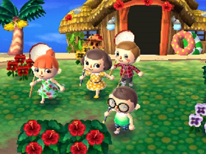
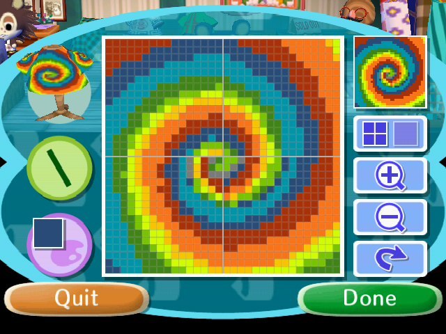
Screenshot from Animal Crossing: City Folk, making custom designs
Possibly the most creative the series has always allowed the player to get is with custom designs. Custom designs allow players to make pixelated artworks that they can use as wallpaper, clothing, paths, or as a means of customizing furniture. Depending on what the design is, it has the potential to add a very realistic style to the game, to a simple, kid-like style to one’s game. The addition of being able to share one’s custom designs online created a plethora of options to players who may feel that they are not “artistically gifted,” making the use of these designs accessible to everyone, despite the level of their artistic abilities.
As the franchise continues to grow, so do the amount of animal villagers, items, and creative options for the players to interact with. Because of the simplified and appealing art style, the franchise has brought in new players and drawn veteran players back to each installment of the series, making it one of Nintendo’s most successful franchises. Other than the use of interactive play and the ability to pace yourself, the art style seems to be what draws many of the players in, as well as the options to screenshot your plays and share them with friends and family on social media. Because of this, it drives players to want to create new builds and patterns and experiment with new styles, pushing the series to its absolute, fullest extent.